3D + drawing
Digital tools paired with hand-drawn lines, notes and graphic elements.
A personal brand for a 3D artist who needed to translate the way she creates, her personality and her visual world into an identity that felt recognizable, flexible and able to grow with her.
Joyce already had a very distinct way of creating. She works mainly in 3D, but is naturally drawn to more hands-on elements: hand-drawn lines, painted textures and characters with personality.
The challenge wasn’t to invent an aesthetic from scratch. It was to look at what was already present in her work, identify recurring patterns and translate them into an identity that could represent her as a creative.
The brand needed to feel professional enough to support her work without losing the curious, expressive and experimental side of the way she creates.
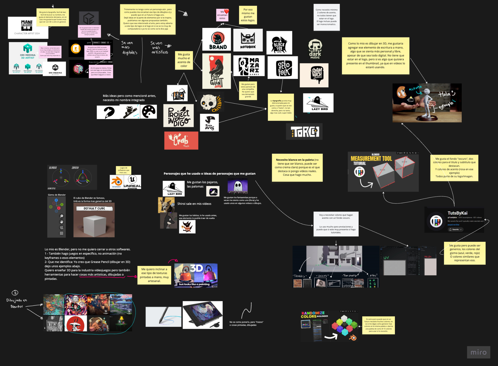
The exploration revealed a few recurring themes: a mix of digital and handmade elements, simple expressive characters, nostalgic references, dark backgrounds, pops of color and a preference for compositions with more personality than rigidity.
There was also a strong contrast between the tools she uses — Blender, 3D modeling and digital environments — and her interest in drawing, hand-made marks and textures that feel more painted than digital.
Digital tools paired with hand-drawn lines, notes and graphic elements.
An identity that could feel contemporary without losing a personal, tactile quality.
Simple characters, expressive references and a slightly unexpected sensibility.
Enough clarity to work consistently without making the brand feel rigid.
One element kept showing up throughout the references: ghosts. Joyce had already used them in drawings and videos, and they naturally fit a way of creating that feels curious, playful, slightly mysterious and nostalgic.
That’s why the ghost eventually became the central symbol of the identity.
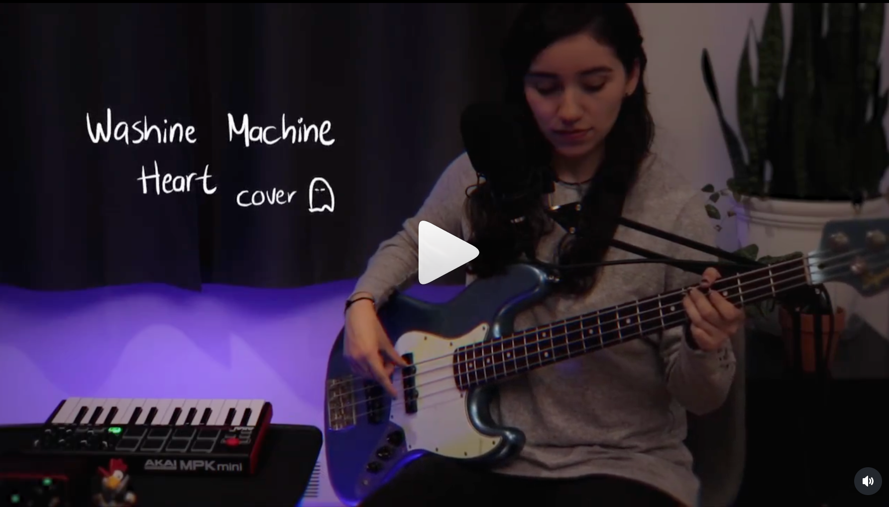
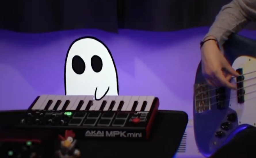
This wasn’t about inventing a character for the brand. It was about recognizing one that already belonged to her world.
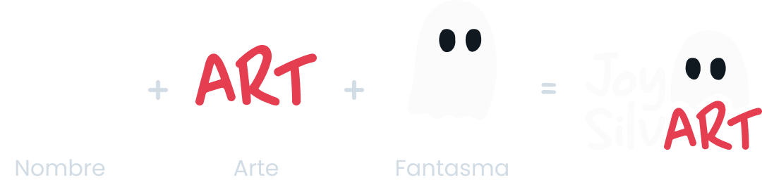
The ghost became the starting point for the brand, integrating the Joy SilvART name and strengthening the connection between Joyce, her work and the visual world around it.
The system needed to work across content, presentations and tutorials while staying flexible enough to live alongside projects with very different visual styles.
The identity is grounded in a dark base, paired with white and a bold red as its main accent. Red brings energy and character, while the dark background creates a canvas that allows visual content to stand out.
Supporting accents in yellow, blue, green and violet were also defined for tutorials, presentations and digital content.
Poppins provides the foundation through its clarity, readability and versatility. Cute Cat brings a more handmade, playful quality to headlines, statements and graphic details.
PoppinsStructure
Cute CatPersonality
The Brand Book brings together guidelines for the brand, color palette, typography and visual principles defined for Joy SilvART.
The result is a visual system that doesn’t try to define what all of Joyce’s work should look like.
Instead, it provides a recognizable foundation she can keep experimenting from: the ghost works as a signature, the palette creates consistency and the rest of the system can adapt to different types of content without losing its connection to her creative world.
The identity supports her work without limiting it.
← Back to case studies